タップで読みたいところにジャンプします
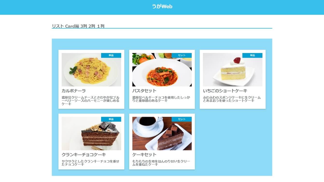
一覧 カード型 仕様
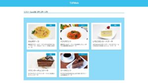
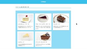
カードはPCでは3枚横並び、タブレットで2枚横並び、スマホで1枚。
リセットcss使用。リスタイルもしているよ。
疑似要素は使ってないよ。
バージョン1とほとんど変わらないからブログに残さなくてもいいかと思ったけど、一応残しておく~。
HTMLのコード(一部)
<ul class="areaCard">
  <li class="areaCard__card card">
    <div class="card__areaImage">
      <img class="card__cardImage" src="./img/pasta_calbo.jpg" alt="">
      <div class="card__cardLabel"><span>単品</span></div><!-- card__cardLabel -->
    </div><!-- .card__areaImage -->
    <div class="card__areaNote">
      <div class="card__cardTitle">
        カルボナーラ
      </div><!-- .card__cardTitle -->
      <div class="card__cardNote">
        濃厚なクリームチーズとさわやかなブルーベリーソースのハーモニーが楽しめるケーキ
      </div><!-- .card__cardNote -->
    </div><!-- card__areaNote -->
  </li><!-- areaCard__card -->
</ul><!-- areaCard -->
SCSSファイル
リセットcss 関係するコードのみ
/* Reset image and restyle */
/******************************************/
img {
  width: 100%;
  height: 100%;
  vertical-align: bottom;
  object-fit: cover;
}
cssコード
/* セクション カード 複数列
/******************************************/

.areaCard {
  width: 94%;
  margin-left: auto;
  margin-right: auto;

  display: flex;
  flex-wrap: wrap;
}

.card {
  margin-top: 24px;
  margin-right: 24px;
  width: calc((100% - 48px) / 3);
  box-shadow: 0 3px 6px rgba(#000, 0.16);

  padding: 16px;
  background-color: #fff;

  &:nth-child(3n) {
    margin-right: 0;
  }

  @include mixin.responsive(md) {
    width: calc((100% - 24px) / 2);

    &:nth-child(n) {
      margin-right: 24px;
    }

    &:nth-child(2n) {
      margin-right: 0;
    }

  }

  @include mixin.responsive(sm) {
    width: 100%;

    &:nth-child(n) {
      margin-right: 0;
    }
  }

  &__areaImage {
    aspect-ratio: 16/9;
    position: relative;
    font-size: 12px;
    line-height: 24px;
    text-align: center;
  }

  &__cardLabel {
    width: 100px;
    height: 24px;
    background-color:variable.$bright1_color;
    color: #fff;
    position: absolute;
    top: 0;
    right: 0;
    z-index: 10;
  }


&__areaNote {
  // height: 315px;
  display: flex;
  flex-direction: column;
  // background-color: #fff;
}

&__cardTitle {
  margin-top: 16px;
  font-size: 20px;
  font-weight: bold;
}

&__cardNote {
  margin-top: 16px;
  margin-bottom: auto;
  font-weight: bold;
  overflow-y: hidden;
}

}

コメント